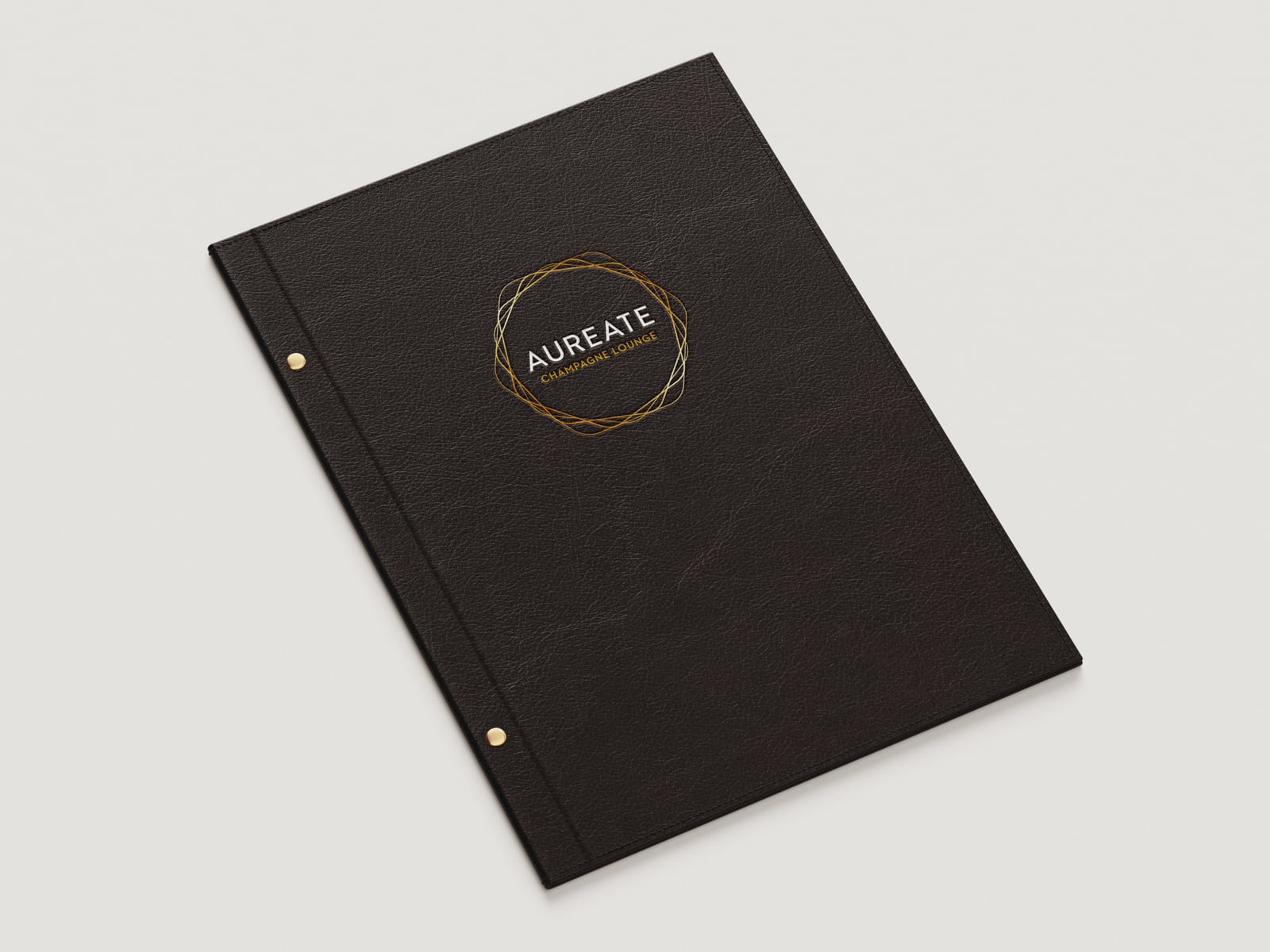
The Aureate Champagne Lounge sought a new logo that would convey an elegant, indulgent dining experience.
Drawing inspiration from Ballarat’s history as a gold rush mining town, we crafted a mark that appears as though spun from molten gold, suggesting luxury and decadence.
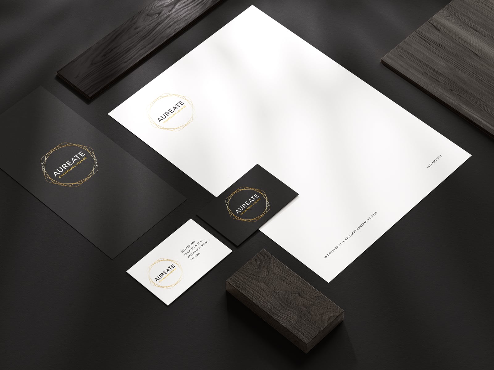
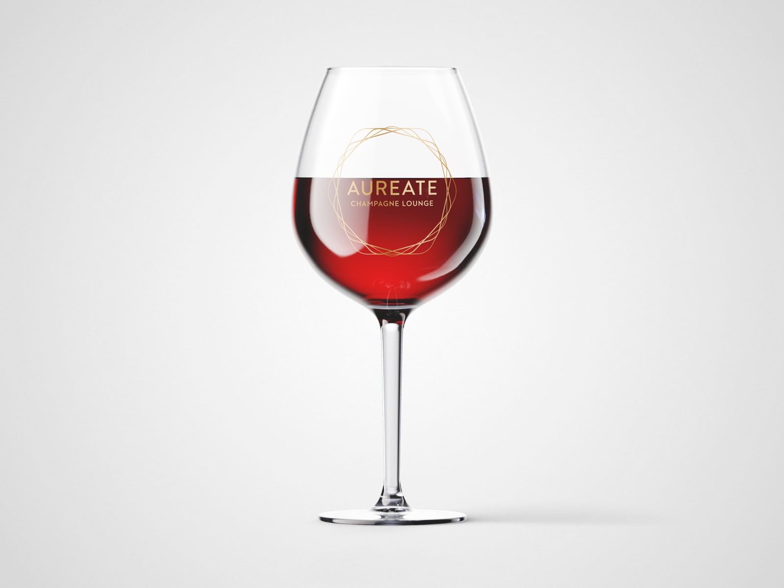
The mark also has the versatility to be used as a stand-alone graphic element on brand touchpoints such as stationery and interior design.
We paired this with a confident type treatment using a geometric sans-serif typeface to further suggest refinement and sophistication.
The final result is a radiant logo that helps the business shine.


