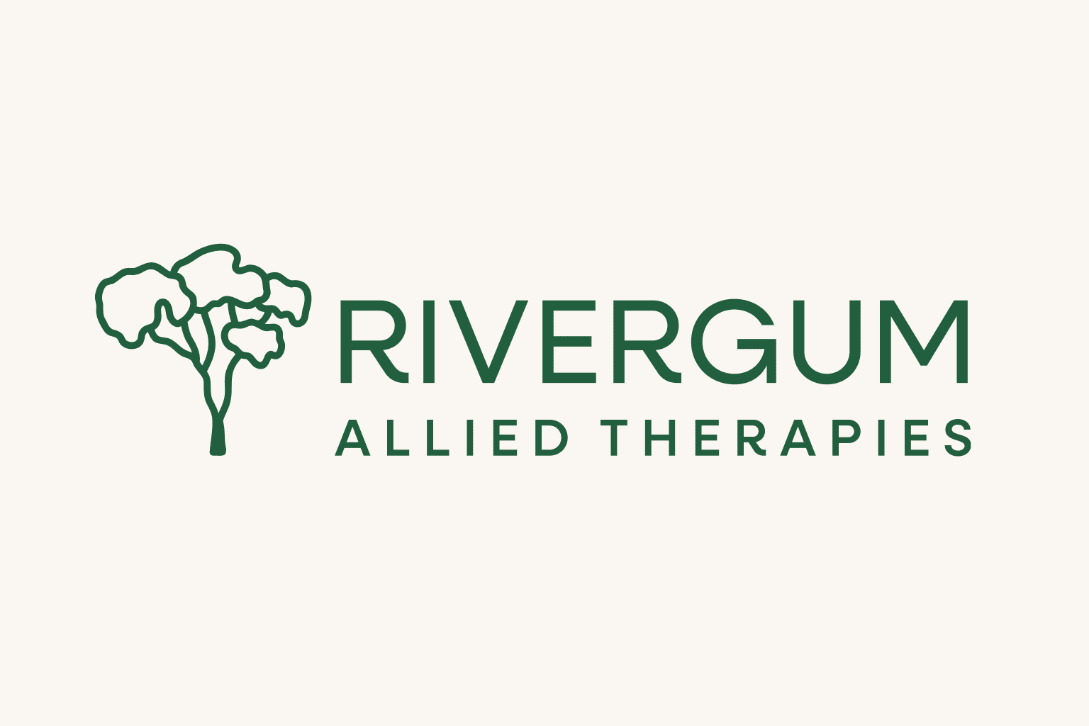
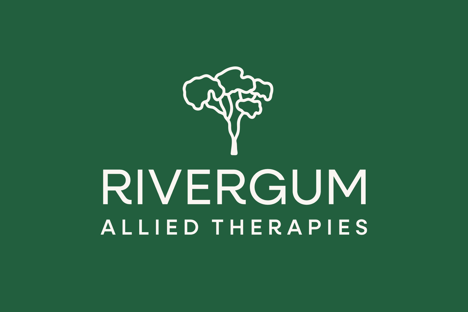
Rivergum Allied Therapies required a refresh of their brand while retaining the essence of their existing logo mark.
The tree logo mark was redrawn to simplify the shapes and improve legibility at small sizes, for example on the client’s website and business cards.
A more distinctive typeface for the logo was also selected, with smooth curves and flowing shapes to make the brand feel approachable and friendly.
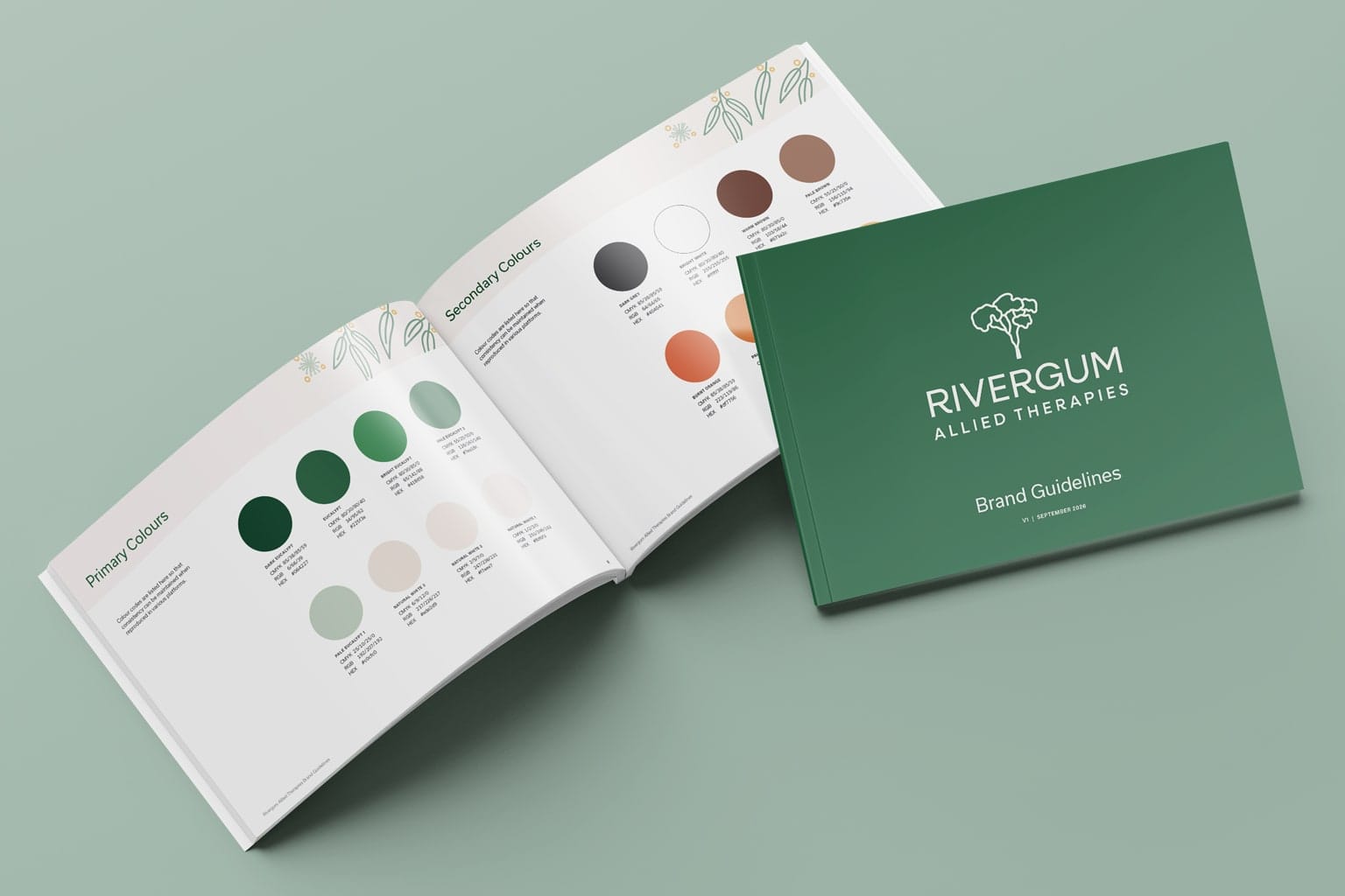
We refined the colour palette by using a more subdued range of greens inspired by Rivergum’s namesake trees, conveying the peace and serenity of native Australian flora. Secondary colours were also chosen as pops of bright colour to draw attention to important information and call-to-actions.
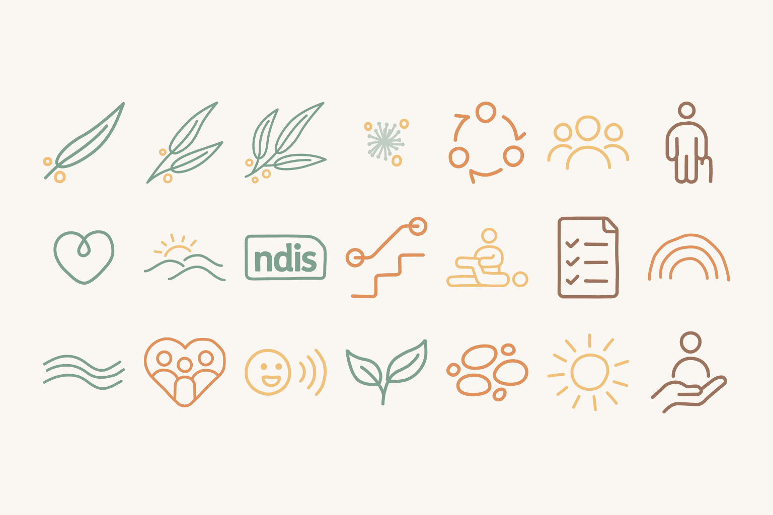
Finally, a versatile set of icons was designed to visually communicate the client’s services and add visual interest. We also supplied a brand guidelines document to keep the brand consistent whether in printed material or on digital devices.